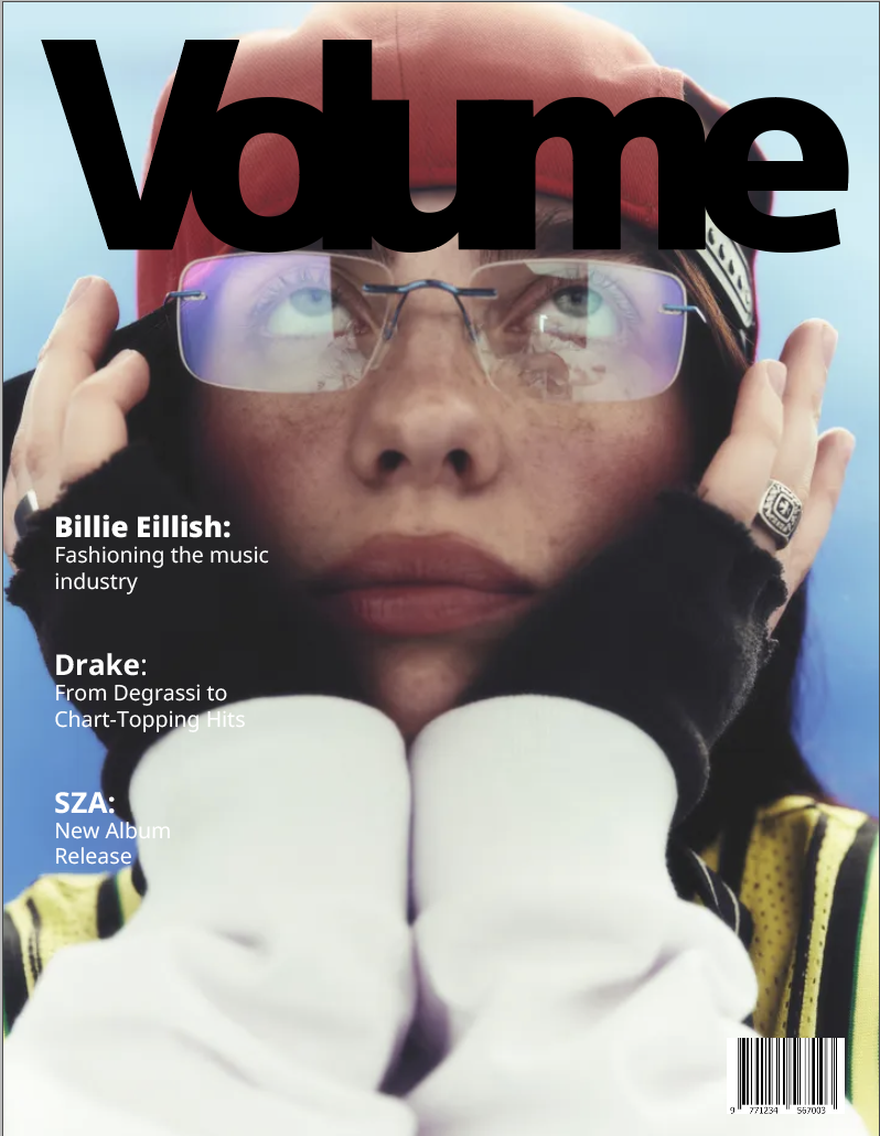
Magazine
This magazine spread explores Billie Eilish’s visual identity through a bold yet restrained layout that mirrors her contrast of softness and intensity. The design balances strong typography with negative space, allowing the imagery to feel intimate without being overwhelming. Color, scale, and pacing were used intentionally to guide the reader and create a sense of rhythm across the spread. Overall, the project focuses on translating Billie Eilish’s mood and presence into a tactile, editorial experience.